
Digital Branding, Content design
Software development, AI
Brand, Website, Communications
2026
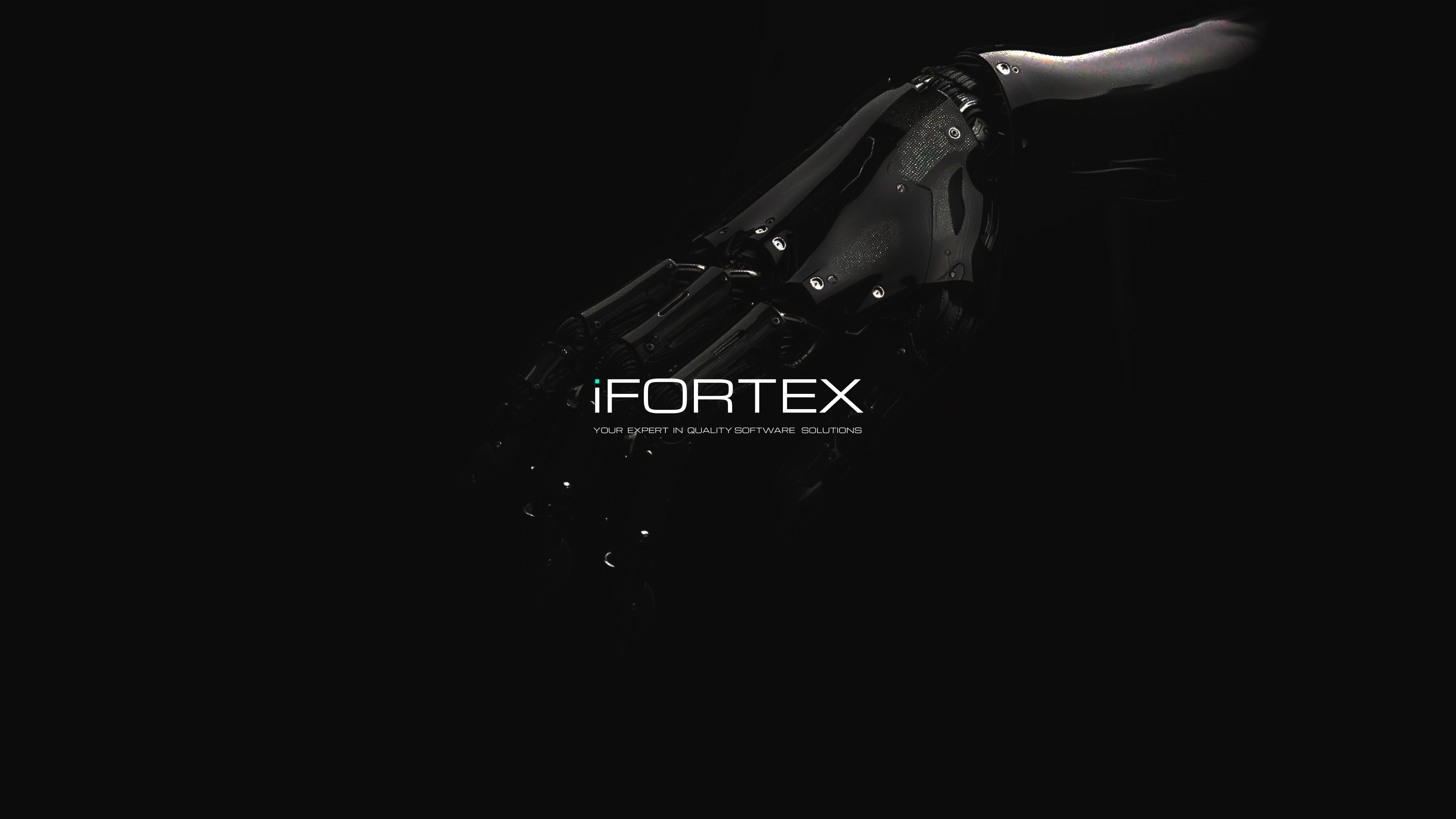
AI Software development company digital branding
Crafting consistent digital brand for reliable IT-company of creating software products with AI and .Net expertise EU, USA, Asia clients
Templates of case
in development still🫨
..But u can find this all cases on my dribbble and Be
Artem C
Designer


Year
2026
Client
FTECH-IT
Category
Digital Branding, Content design
Application
Brand, Website, Communications
Industry
Software development, AI
My role
Digital Product & Brand Designer, Art Direction
Overview
The goal of this project was to transform the visual presence of an IT company into a cohesive, scalable B2B digital brand. Working closely with cross-functional stakeholders, I designed and developed a comprehensive identity system tailored for international markets (EU, USA, Asia). The project was executed in two systematic iterations: establishing a token-based visual framework across all digital touchpoints, and refining the brand’s positioning to communicate expertise, credibility, and trust in the enterprise AI & .Net software sector.
Let's design your vision into reality
Just contact me and lets start work together
Contact
Introduction
As I mentioned in case Visible by Design, I don't believe in designing in a vacuum. The strongest brands aren't built in isolation or within a single deliverable — they evolve through real applications, continuous testing, and everyday use.
This project became an opportunity to push my visual thinking further than a typical design request would allow. Beyond creating a brand identity, it explores how a digital brand can communicate consistently across websites, marketing materials, presentations, and product touchpoints while remaining flexible enough to grow over time.
Brand Concept
The visual foundation is built around principles of precision, structural stability, and forward movement—core attributes of a reliable enterprise technology partner. The design system leverages subtle aviation metaphors: the geometric rhythm of the logo and UI accents references aerodynamic forms, symbolizing technical confidence and performance. To balance the coldness of infrastructure tech, modern generative visual elements and intuitive interface affordances were introduced, creating an approachable yet highly professional digital environment
Logo
As mentioned earlier, the brand evolved through two major iterations. Because rebranding is an incremental process rather than an instant transition, two primary blue colors coexist within the identity. Both remain valid, although the darker blue represents the current direction and serves as the primary brand color in the latest guidelines. The color system was designed to be flexible across different touchpoints. While the core identity is built around four foundation colors, each application has its own semantic palette derived from these tokens. The website, for example, uses an extended tonal system optimized for interface design, while presentations, marketing materials, and other assets apply tailored palettes that preserve visual consistency while adapting to their specific context. This token-based approach allows the brand to scale across multiple platforms without sacrificing coherence or recognition.
Brand Palette
The identity utilizes a token-based, dual-palette color system designed for evolutionary scaling. Instead of a rigid overhaul that breaks continuity, two core blue tones were engineered to work in parallel: the vibrant blue maintains connection with existing product interfaces, while the deep dark blue establishes the new enterprise-grade positioning. Each digital environment (from Webflow CMS to pitch decks) generates its own semantic palette derived from these foundational color tokens
Fonts
The brand typography pairs Inter for high-density interface readability with Outfit for expressive marketing headlines. The logo itself is a customized wordmark; individual glyphs underwent rigorous optical adjustments to refine spacing, visual weight, and balance. Alongside the core visual assets, the project established standardized naming conventions and implementation guidelines to maintain brand coherence across physical merchandise and multi-platform software interfaces
Webflow Infrastructure & Deployment
The corporate website serves as the primary engine for the brand’s visual and commercial communication. Designed and fully developed in Webflow, the site architecture relies on a highly modular CMS framework. This setup empowers the international sales and marketing teams to deploy new enterprise case studies, adjust commercial layouts, and manage localization independently—eliminating ongoing engineering bottlenecks and reducing time-to-market for marketing campaigns
Brand Communication
The visual language follows a clean, technology-driven aesthetic. The darker blue palette subtly echoes the familiar blue system screens, reinforcing the company's software expertise and technical positioning.
The website was fully designed and developed in Webflow, including a CMS structure that allows the sales team to manage content independently. Beyond the website, the identity extends across marketing materials, presentations, and branded merchandise, ensuring a consistent experience across every touchpoint.
From Linked In Recommendations:
I had the pleasure of working with Artem on several branding and digital projects at FTECH-IT. Artem is one of the most autonomous designers I've worked with. He is able to take ownership of a project from the initial concept through execution and delivery, requiring very little supervision while maintaining high quality throughout the process. During our collaboration, he led the design of multiple digital brands, created visual communication systems, developed marketing materials and merchandise, and was fully responsible for our corporate website — from early concepts and UI design to Webflow implementation, launch, and SEO preparation. Beyond strong visual skills, Artem combines branding, product thinking, and technical understanding, which allows him to work effectively with both marketing and development teams. I would confidently recommend him to any company looking for a multidisciplinary designer who can independently drive branding and digital design initiatives.
Eugen Lagutin
Founder FTECH-IT

Open for fulltime job and B2B collabS
artem c
Next step
LET'S WORK TOGETHER
See a case
Digital Branding & corporate design
